Well, the new film isn’t finished yet. I’m here to revive this old blog with updates on the process of my NEXT film. Here I am, at my desk, sitting with the early stages of the follow-up to Little Theatres: Homage to the Mineral of Cabbage. It’s called Invisible Harvests.
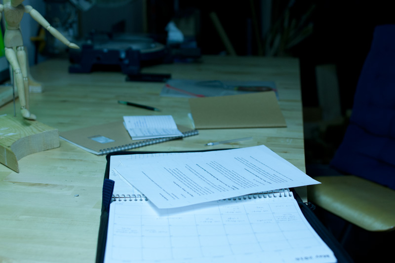
I’m really excited to finally be making this announcement. I’ve very gratefully received funding from the Toronto Arts Council, Ontario Arts Council, and Canada Arts Council for this project. I’ve been working on the film on and off for the past year. This time it’s a more experimental film, so it needed quite a bit of research, both technically, structurally, and thematically. I’m writing this one myself, so I’ve been spending a lot of time writing, researching, re-writing, editing, and researching some more. I’ve stuck many sticky notes onto a large cork board in my office, with jotted-down thoughts like:
organize invisible by:
• body organs (in groups)
• elements (of world)
• times of day / day of year
• [planets]in 3- or 4-dimensional chart.
This was taken off the top of the (now) stack of sticky notes. These were written a year ago and I admit I’m not exactly sure what this one means anymore. But it was all absorbed somehow and processed and has come back out in the form of a script, which I can now hold in my hands.
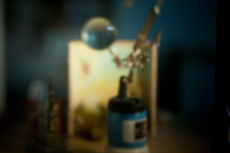
Over the next couple of months, I’ll be building new sets, and designing and creating new puppets, and showing here how it all unfolds. I’d like to start with the sets this time; I think for the last film I started with puppets. But the sets in this film are central to the story.
The “story,” by the way, is not as much a story as it is a visual poem. It loops around without narrative, although it is structured by Chapters. The theme of the film is fermentation, though the word “fermentation” doesn’t appear anywhere in the script. It’s also about time, death, renewal, cycles, nature, optics, farming, cooking, alchemy, and healing.
I’ll be updating this blog, and instagram page, with my progress as I go. I’m hoping to finish the film in the next 12 months, which may be ambitious for a six minute (or so) film that I’m working on pretty much by myself. We’ll see!
Invisible Harvests will eventually have its own associated website about fermentation, here.